What makes the best comic book covers? It’s a great topic for debate. For us as individuals there is no wrong answer, of course. It’s purely subjective. But with a little thought it is frequently possible to explain what it is about a particular image that grabs you. The best ones are the ones that make you stop and check out something you weren’t previously going to purchase – and in some cases, you even end up picking up a title you’ve never even heard of before.
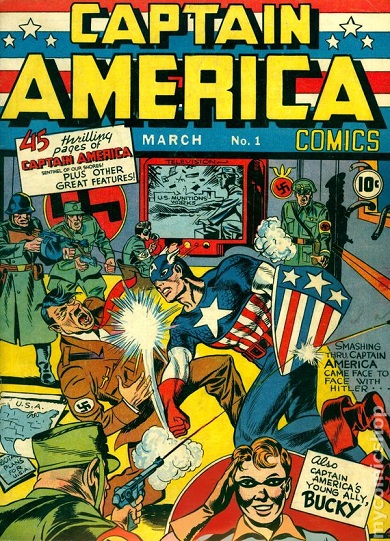
It may be the loudest sock on the jaw in the history of comic books. A full year before the attack on Pearl Harbor, Captain America #1 (March 1941) saw Adolph Hitler himself being laid out by the powerful right fist of a masked man clad in the closet thing possible to an American flag.
This legendary cover by Jack Kirby is jam-packed with gunfire, a television set and plenty of rifle-toting Nazis. It is a busy cover with little room for either the reader or Cap to take a breath.
No one seeing this book for the first time in late December 1941 could mistake it for anything other than an attack on the madness that was raging overseas. It was the first of what would be many clarion calls to action on comic book covers over the course of 1941.
There were a few other comic books on newsstands that month that alluded to the war or conflict overseas. Target Comics #13 (March 1941) from Novelty featured patriotic statements filled with red, white, and blue imagery. MLJ, (Archie), had The Shield, who actually had the first patriotically-costumed hero. They put him on the stands with Shield-Wizard Comics #2 (Winter 1941). But on that cover their hero he was dealing with a knife-wielding, caped villain which is pretty standard fare when it comes to comic book covers of the day.
Quality had patriotic heroes such as Uncle Sam in National Comics. But on his early covers he fought crime, not Nazis.
In house, at Timely, Human Torch #2 (Winter 1940) shows the headlining hero melting walls to stop a gun-wielding kidnapper. And he certainly wasn’t doing it in a red, white, and blue costume. No one took the patriotic idea as far as Simon and Kirby.
Leading up to the first issue publisher Martin Goodman had given Kirby and editor Joe Simon the approval for a new book. A veteran of publishing pulps, Goodman was struggling to find a place in the brand new world of comic book publishing. He was having limited success with the Torch and Sub-Mariner but looked to his best team to give him his dream, a Superman-level hit.
Working from drawings that Kirby had already been experimenting with, Captain America #1 blew all expectation out of the water. It ended up going to a second printing with a print run that exceeded 900,000.
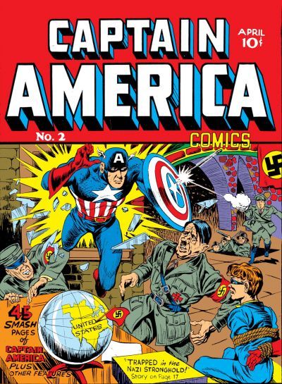
Captain America #1 had hit newsstands on December 20, 1941. With publisher Goodman breathing down their necks, Kirby and Simon had to prepare Captain America #2 (April 1941) without exactly knowing what the sales numbers on issue 1 were.
As they worked on that issue they could see what was happening on the streets of New York. They had to know that the title was selling quickly. They walked past newsstands, they checked their own work as a matter of business. Friends in the industry could see how popular the title was.
Still, issue 1 hit newsstands at Christmas and, given the incredibly tight lead time they had for a deadline, Captain America #2 needed to be ready for publications before any relevant info about what was making the first issue sell came in.
Captain America #2 is nearly as astounding a cover as that first issue’s was. It doesn’t have the tech look of the big TV screen or the large number of Nazis getting mowed down. But it served the title perfectly. Looking at it you can see Simon and Kirby thinking on their feet as they make a few changes from issue 1.
First, they got rid of the patriotic banner across the top and simplified the attractiveness and directness of the title by going with a solid color as a background. Taking up the top third of the cover, the title banner is like a brick wall. It is massive and it just sits there yelling one thing: CAPTAIN AMERICA.
There are no sweeping curves of letters, just simple, neat block letters with a touch of dimensionality that make an immediate and simple declaration. This is one person’s book, the character of Captain America. They are establishing a brand and style that a reader can easily locate amidst the confusion of surrounding issues.
Captain America, still larger than life, is bursting straight through the wall against a yellow background that pushes him out in front of the title banner. We can’t help it but our eyes go straight to Cap. And boy, is he ready to tear Hitler apart. One look at Der Fuhrer’s face and you can just see that he is shocked and clearly worried. This isn’t going to end well for him. We don’t even see poor Bucky tied up in a chair in the corner!
The Timely covers of the period are filled with action. Alex Schomburg created massive, single page dramatic scenes that needed every single square inch of space. Simon and Kirby were capable of that as well. Just check out Captain America #1. Kirby goes wild. It is pure kinetic energy somehow captured in two dimensions and on paper.
On issue 2, Joe Simon takes over the pencils. Where the first issue was a cacophony of confusion all stabilized by a punch, the second one is pure corporate organization. The cover is laid out in such a way that no matter what, you somehow only seem to be aware of Cap. While it is filled with action, Simon’s cover just isn’t as jammed as Kirby’s previous cover art was. There is just a bit more breathing room. It may not seem like much. But that extra room tightens up the focus on the hero.
This time there are only two soldiers, each firing from off to the right. One of them hits Cap’s shield and the little white star-burst as the bullet bounces away from his shield is a nice contrast to the larger yellow burst behind Cap. That yellow burst begins a trail that causes your eyes to drift to the bottom of the magazine. It starts at the top and leads through the yellow of the US on the globe. It then continues down to the yellow tablet at the end of the table at the bottom of the cover.
The muted color of the green uniforms as well as the large amount of browns and the grey shadow that keeps Bucky’s costume from appearing in its full glory all contribute to the way that everything serves to push Captain America to the front.
Where the first cover was an open and violent declaration of feelings, the second cover seems to announce to Hitler “We are coming and you cannot stop us.”
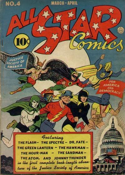
This wasn’t the only war-themed cover on newsstands that month. Action Comics #35 (April 1941) saw Superman getting shot in the chest by a machine-gunner and over on All-Star Comics #4 (March/April 1941) the entire Justice Society of America was racing past the Capital Building.
But no one in comic books at the start of 1941 was openly declaring their allegiance to anything other than patriotism. Simon and Kirby were sending Hitler a middle finger and their publisher Goodman couldn’t seem to have cared less. As long as the books sold.
And sell they did. Even though Simon and Kirby were working in the dark, each of them unable to gauge exactly what would make this new title sell, Captain America #2 knocked it out of the park for a second time. Sales matched that of the first issue.
Future covers for Captain America would be filled with massive and detailed action. For issue 2 Simon and Kirby took everything down just a small notch and delivered a strong, confident message to Hitler, “America is on its way!”
-Mark Squirek