What makes the best comic book covers? It’s a great topic for debate. For us as individuals there is no wrong answer, of course. It’s purely subjective. But with a little thought it is frequently possible to explain what it is about a particular image that grabs you. The best ones are the ones that make you stop and check out something you weren’t previously going to purchase – and in some cases, you even end up picking up a title you’ve never even heard of before.
It’s time for More Fun in December!
The entire month of December “Cover Story” will be looking at cover art from one of the hardest working anthologies in the history of comic books: DC’s Golden Age great More Fun Comics. As we do, you will see a couple of holiday themed issues as well as some thrilling covers featuring Green Arrow, Dr. Fate, and Jonny Quick.
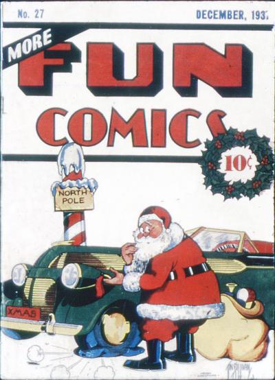
Let’s start this wintery month off with a look at More Fun Comics #27 (December 1937). Cover artist Vin Sullivan creates a comical Santa Claus flummoxed by a flat tire.
One of the things that so striking about this cover is the massive use of white and how well it works to create an environment. The effect is only enhanced by the decision to keep the title banner which slips across the top third of the cover white as well.
That prominent placement of red continues down the left side of the cover on the ribboned barbershop pole. Which itself is so easily balanced by the green (with flecks of red mistletoe…) of the circular wreath on the right.
Without the presence of the barbershop pole and the wreath, as well as their opposing shapes (line vs. circle), there would just be a strip of white moving horizontally across the middle. There would be nothing uniting the cover itself into a single image.
The space is also opened up by having a line (the pole) on one side and a circle (the wreath) on the right. That little space of white underneath the wreath allows the cover to go on as the white is only limited by the cut of the paper itself, not artificial borders.
All of this is centered by the man in the red suit. By now the image of Old St. Nick in the eyes of most America has been shaped by Thomas Nast at the turn of the century. Then just a few years before Sullivan drew this cover, by Haddon Sundblom work on the character for Coca-Cola.
Sullivan knows exactly how the old elf should look and draws an image of Santa Claus that has now solidified in the public’s mindset over the last 40 years. Only he has rounded off the detailed edges that were needed by a Santa who has to sell Coca-Cola and given him the feel of a good animated cartoon.
That is one sleek, luxurious automobile. Apparently Santa is either renting for the holiday or has made enough money over the last few hundred years to get himself something nice. The car trails off into infinity at the edge of the right side. Who is to say that it isn’t as long as the eternally long auto that Tex Avery used to drop into Droopy cartoons… It certainly reflects the ideas of art deco and modern design found in everything from architecture to radios by RCA.
Now, back really quickly to the general shape of the things on the cover. Look how their shapes not only help build the wonderful sense of dimension in this cover, but also allow each part of the cover to claim some space of its own.
Santa: circle. Car: long horizontal line. Pole: Vertical line. Title Banner: horizontal black lines. Taken together your eye starts to move to the back of the image only to find the vastness of a blizzard. The blankness of it all pushing the images even further forward in our eyes.
The comic industry wasn’t even 5 years old and Vin Sullivan was creating artistic templates that others would follow for decades to come. In another few months, working as an editor Sullivan would also make the decision to place Superman in Action Comics #1.
As the month rolls on we are going to look at the history of the title as well as a few more covers from More Fun covers that feature heroes. At the end of the month we will come back to the holidays with Sullivan’s New Year’s follow up to this week’s cover.
-Mark Squirek