What makes the best comic book covers? It’s a great topic for debate. For us as individuals there is no wrong answer, of course. It’s purely subjective. But with a little thought it is frequently possible to explain what it is about a particular image that grabs you. The best ones are the ones that make you stop and check out something you weren’t previously going to purchase – and in some cases, you even end up picking up a title you’ve never even heard of before.
During its 12-year run, the cover art created for More Fun Comics featured everything from smiling kids messing around the swimming hole to the judgmental glare of The Spectre. The title, like another DC classic Star-Spangled Comics, is one of the strongest workhorse anthologies of the Golden Age.
Historically the title has a few things going for it as well. More Fun Comics is the very first comic book published by the company that would evolve into DC. In addition to this, it was the very first comic book to be comprised of entirely original material. If that isn’t enough to cement its place in the hall of fame, in issue #6 (October 1935) the first work by two kids from Cleveland named Siegel and Shuster was published.
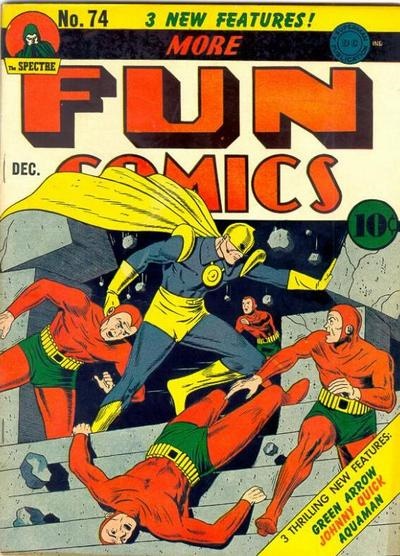
Before we get to Doctor Fate’s big UFC competition on the cover to More Fun Comics #74 (December 1941) let’s spend a minute with More Fun Comics. While they may not have graced the cover in their first appearances, this is also the first issue where Aquaman, Green Arrow, and Johnny Quick appear for the first time.
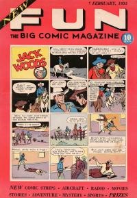
Debuting on newsstands in late winter of 1934, New Fun: The Big Comic Magazine (#1) featured something familiar to readers. They could recognize the format that the cover displayed.
Surrounded by a thick, light red boarder with titles atop the first quarter of space, the majority of the cover looked exactly like a Sunday newspaper comic strip. Everyone who walked a city street knew what a Sunday newspaper comic strip looked like and rural America did as well.
A person gazing at the selection on the newsstand could recognize the format, but not the character inside the feature. The cowboy in the title of that strip, Jack Woods, was an entirely new creation. So were stories featuring Buckskin Jim, Don Drake, and a couple of knuckleheads called Bobby and Binks.
The founder of DC actually saw the change possible in the brand new medium of comics. Up until New Fun hit the stands, every other comic book for sale was comprised of reprints with maybe a page or two of original text or art.
While conducting his career in the Cavalry, Wheeler-Nicholson had written and been published professionally. After his discharge he moved into pulps and even ghost-writing. In order to publish New Fun, the Major formed a new publishing company called National Allied Publications.
It may seem like a minor note in the scheme of things, but by putting nothing but original work and stories inside his new book, New Fun, Malcom Wheeler-Nicholson was essentially putting a color version of the TV show Bonanza against a competitive line-up that was all black and white.
The only problem is that not everyone has a color television. The public isn’t thinking in terms of “all-new” comic books yet. On the cover he chooses to push the word “new” just twice. Even he doesn’t make a big deal about it.
But he did make a big deal out of the book itself. At 10” by 15” this was a physically large book. Especially when compared to Famous Funnies and the other reprints of the day. These books are very close in size to what we consider modern comic books.
However, there was a precedent for the size of More Fun. Until Mr. Gaines had the insight to fold a newspaper comic section in half again, some reprints had been published in tabloid-size. Plus, if you are a new book, why not tower over everyone else around you?
More Fun evolves while Wheeler-Nicholson’s company grows. He begins to hire staff and starts to build the company. During these early days he meets a young man named Vin Sullivan. As the cover artist to both our December 2 and our December 30 Cover Story column, we will get back to Mr. Sullivan right before the New Year.
When, our cover subject, More Fun Comics #74 comes out in 1941 the title has now been published for six years. It has undergone two minor name changes as well as a change in ownership. Naturally the book has shrunk in physical size since its wild days as a tabloid-sized feature. Wheeler-Nicholson had quickly adjusted the size of his publications to match the way that comic books had developed.
In 1938 Siegel and Shuster had been able to sell their creation, Superman, to Vin Sullivan, who was by now an editor at DC. He was the one who made the decision to put the man in the cape on the cover of Action Comics #1 (June 1938), When he did, comic books exploded.
In the rush to capitalize on the sudden success of comic book sales, owners called out for new characters. Dr. Fate had arrived in that first wave of inventive creation that whipped through the industry for a few years.
Created by Gardner Fox with art by Howard Sherman, Dr. Fate had made his debut in More Fun Comics #55 (May 1940). With More Fun #68 (June 1941), he takes over as the cover subject from The Spectre.
The next nine covers as well as the interior stories that featured Fate would be drawn by Sherman. While the hero was mystical in spirit and tradition, Sherman tends to draw a Fate that is more physical. His covers feature action. On one Fate ripping open a Nazi sub. On another cover Fate is crashing through a ceiling window to foil a robbery.
More Fun #74 is one of Sherman’s best efforts. First, he places Fate in a stunningly heroic pose. Look at the way that big yellow cape flies out behind him. He has one villain by the neck (ear?) and another lies across the steps. Still another is running away from Fate’s furious actions. This is a compact scene on the steps of a building but it appears to be enormous!
What really kicks it in is that the background is on a solid color. Yes, the background is really a building falling down around him. But the first, quick impression is that it is grey. The red of the foes and the blue of the hero bounce so perfectly off of it that it builds on the sense of dimension inside the image.
An artist such as Jack Kirby or Alex Schomburg might have filled in the relative emptiness of the building with a bit more detail. Sherman keeps his cover uncluttered, clean. It is important to take into account that while Kirby or Schomburg may have had some leeway when they worked for smaller comic companies, Sherman was at DC. It hadn’t taken long for the company to develop a house style. Howard Sherman was a pro in a rapidly developing field and he knew how to create a strong cover image.
Also inside this issue was Green Arrow, who, with More Fun #77 (March 1942) would replace Fate on the covers. We will get to him shortly. Stop by next week when we continue our mini-history of More Fun comics while saying how do you do to Johnny Quick.
-Mark Squirek