What makes the best comic book covers? It’s a great topic for debate. For us as individuals there is no wrong answer, of course. It’s purely subjective. But with a little thought it is frequently possible to explain what it is about a particular image that grabs you. The best ones are the ones that make you stop and check out something you weren’t previously going to purchase – and in some cases, you even end up picking up a title you’ve never even heard of before.
Every comic fan knows that when you stumble across a good anthology, you have found comic book joy. The very first comic book was an anthology. Superman showed up in the first issue of an anthology title, Action Comics. The Silver Age Flash debuted in an anthology and so did The Amazing Spider-Man.
One of comic history’s greatest anthologies, Dark Horse Presents, has now quietly brought great comic book art and writing to fans for 30 years. As a title it slipped over to an online presence in 2007 but came back into print in 2011. In 2016, the title is still going strong featuring published work by many of comic’s top talents including Paul Levitz, Carla Speed McNeil and Michael T. Gilbert (Mr. Monster!), and Craig Rousseau.
When the Dark Horse Presents debuted in 1986, the comic industry was on the rise after decades of neglect by anyone other than fans. Thanks to titles such as The Man of Steel, Watchmen, Raw, and The Dark Knight, the mainstream media was looking at comic books differently. Magazines such as Rolling Stone, The New Yorker and even local newspapers began to look at comic books in a way that many had never thought of before, as an art form. The change in public perception wasn’t just due to quality art and stories.
A revolution in distribution was changing the way that fans could buy comic books. After decades in the marketplace they had finally cut their ties to newsstands, grocery stores, delis, restaurants, train and bus stations, and any other place that stocked comic books as a second thought. Around the country small comic book stores began to pop up in strip malls and old buildings. Comic books were becoming a destination purchase and in the process, they established themselves with a new validity and new energy in the marketplace.
It was cool to read comics and fans were coming back. But as modern and hip as comic books looked to so many, as direct distribution worked out the kinks and new shop owners helped bring in new readers, there is always one inviolable rule to the industry. You need a good cover to sell a new book.
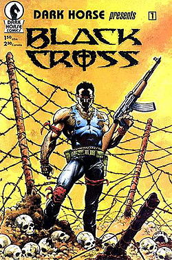
The first issue of Dark Horse Presents featured Black Cross. He is a perfect representation of what many heroes were moving towards in comics at the time. He is overly muscled, surrounded by skulls and holding a weapon that could take out a small army. Nothing against artist Chris Warner’s skill, the cover is engaging and balanced and the figure is appropriately menacing and mysterious. But the idea and execution of the cover is punishing in its relatively generic approach. Nothing about the cover sets itself as separate from anything else on the stands at this exciting year in comic history.
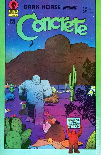
Dark Horse Presents #2 is where comic books actually change the most in the landmark year of 1986. Paul Chadwick’s cover art took the magnetic eclecticism of Art Spiegleman and Francoise Mouly’s RAW and married it to the heroic, genetic mutations of X-Men, Doom Patrol, and a good amount of science fiction in comic books.
As a company Dark Horse had a lot riding on every single cover of this title. It was their flagship book. Fans could come back to Batman, but they needed to discover Concrete as a character and more importantly, Dark Horse as a comic book publishing company.
By taking a 180-degree turn away from the muscled destruction found on many other comic book covers of the time, Dark Horse was putting a lot on the line with the second issue. They were not only counting on the intelligence of the growing audience for comic books, they were also looking to open the mind of established fans who thought that a hero without a cigar, gun, or attitude was a waste of time.
Like other new publishers of the time they were also changing the dialogue on creator’s rights as well as sales and the way that comic books were presented to the public. So, the company’s success meant something more than just sales on an individual title, it was sociological as well.
Before creating the cover for Dark Horse Presents #2, Paul Chadwick had been a storyboard artist for films and also worked on Dazzler for Marvel. So he had seen hype and failure inside the comic book industry first hand. His character Concrete had made his debut in the first issue of Dark Horse Presents. But he, like the two other stories in that first issue, was lost amongst the barbed wire, the blazing calling card sunburst of yellow, and the studied, judgmental alienation of its subject.
Dark Horse Presents #2 was the complete opposite. Those who had expected a continuation of heroic posturing with big, big guns were in for a shock. Chadwick’s cover is a beautiful marriage of the Arizona desert of Krazy Kat and the peyote-inspired writing of Castaneda with the monster-crazed brain of a science fiction fan of the ’50s. The cover looked nothing like the Punisher. It looked nothing like the Dark Knight. Any reference to the apocalypse was a personal reference and as far as we know, the book shipped on time. It was comic heaven.
It was totally individualistic cover that spoke of calm determination in a time when everyone thought the next big thing in comic books was literally, the next big thing. Or possibly a mutated koala bear.
The logo for the hero that stretches out across the top matches anything Ira Schnapp ever crated for DC. The word “Concrete” is powerful, direct, and yet somehow kind of easy going in the way that it floats over the mountain below it. The gentle curves of the font become instantly identifiable.
The presence of a rock monster spoke to fans of ’50s monster books and the simple image of the character holding a title card that said “Under The Desert Stars” spoke of bigger thoughts and ideals than a monster from another dimension. That title isn’t a declaration of combat or aggression; it is an invitation to reflection which directly contradicts the determination found on the face of Concrete himself. What exactly is going on under the desert stars?
Which is why, in 1986, you had to at least pick up the book to look at it. It was that different. It was that new and it was a time for readers to take a risk and many readers did.
Dark Horse gambled on calm thought, reflection, peyote and shades of glorious purple in a time when silhouettes, bullets, dames and muscle were selling books. Concrete was different. The hero called out to you with cacti, flowers, and the power of the earth. He also told you that Dark Horse was a company that would take risks to bring readers the best it could.
-Mark Squirek