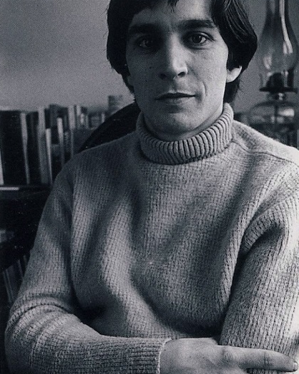
Wes Wilson is often considered to be the father of 1960s concert posters. Born Robert Wesley Wilson in Sacramento, CA on July 15, 1937, he wasn’t particularly interested in art while growing up. His interests were geared more toward nature, leading to studying forestry and horticulture at a junior in Auburn, CA. After that he attended San Francisco State, majoring in philosophy, but he dropped out in ’63.
Wilson self-published his first poster in ’65, nicknamed the “Are We Next?” poster. It depicts a swastika inside of an American flag motif and served as a protest piece for Wilson’s disagreement with the U.S.’s increasing involvement in the Vietnam War. The poster symbolized his political standpoint and willingness to speak his opinion.
He joined San Francisco’s Bay Area in late ’65 to early ’66 during the period when the alternative culture scene was becoming popular. Wilson met Bob Carr, who had created the small firm Contact Printing in his basement. Carr was involved in San Francisco’s beat poetry and jazz scene and hired Wilson as his assistant and partner. Wilson did the basic layout design for much of the work. They made handbills for the San Francisco Mime Troup’s ‘Appeal’ parties fundraising events and the Merry Prankster Acid Tests. Both the Mime Troupe and Acid Tests were connected to the dance hall scene through benefit concerts.
This led the venues, such as the Avalon Ballroom and Fillmore Auditorium, to become linked to Contact Printing. Wilson designed the first handbill for Trips Festival, which is considered one of the preliminary events for the San Francisco concert scene. He went to the event and was inspired by the experience, which led to making posters for promoter Chet Helms shows at the Open Theater. He designed the original logo for the Family Dog, then Helms hired him to be the primary artist for Family Doug at the Avalon Ballroom.
Wilson started making posters for Bill Graham and the Fillmore Auditorium. He eventually stopped working for Family Dog focusing his work on Graham and the Fillmore. Wilson has noted that Helms and the Avalon Ballroom usually gave him a theme to work around while Graham and the Fillmore gave him freedom to design posters however he wanted. Wilson preferred that artistic freedom.
Around this time period a friend showed him a poster Viennese Secessionist artist Alfred Roller did in 1908. The art featured a lettering style similar to Wilson’s, further inspiring his art. Wilson embraced the Roller style, which led to a wave of lettering creativity that completely changed how posters were lettered. His work inspired the psychedelic poster trend.
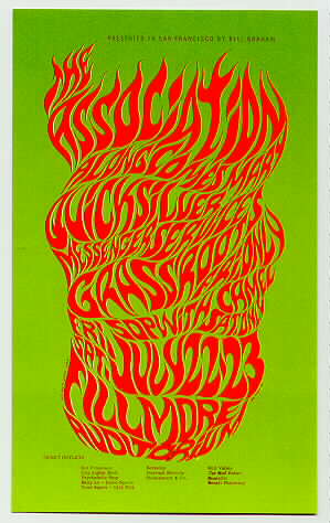
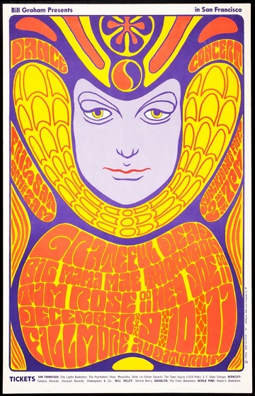
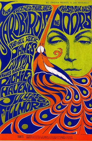
When creating a poster Wilson covered all of the space with fluid form letters that often created shapes and became the norm used by all psychedelic artists. His work helped connect psychedelic posters with the music. The first definite example of how Wilson did this was on the BG-18 poster done with the Association at the Fillmore. The piece is set in green with swirling flame-form red letters. It became a new concept of art for the time period.
In ’66 he created a poster for the Winterland that has been nicknamed “The Sound.” The poster embodies two elements of his style, covering the space with vibrant, flowing letters and his admiration for the feminine form. It is considered to be a representative of the entire time period of art.
Wes Wilson defined the psychedelic poster style and was the most popular artist of the time. He earned a $5,000 award by the National Endowment for the Arts in ’68 and has been profiled in Life, Time, and Variety magazines. His art was on display at the Springfield Art Museum in ’89 in the show “Looking Back: Rock Posters of the 1960s by Wes Wilson.” His love of poster art reemerged leading to creating Off the Wall, a journal on poster art and concepts. He printed nine issues, which have become highly sought after collectibles for poster enthusiasts. Nowadays he paints and occasionally creates new posters in southwest Missouri where he lives with his wife.