Because COVID-19 has caused a major disruption in new comic books, for the next few weeks Scoop will reexamine issues, runs, trades, and titles that are already available. We’ll take a look at perennial classics, current titles we are enjoying, significant runs, and our overall favorite books to suggest some new reading material or inspire fellow comic fans to dust off the old favorites. And if you live near a comic shop that’s still open during this time, we hope our suggestions will prompt you to check out their back issue and collected edition inventory. What makes the best comic book covers? It’s a great topic for debate. For us as individuals there is no wrong answer, of course. It’s purely subjective. But with a little thought it is frequently possible to explain what it is about a particular image that grabs you.
Magnus Robot Fighter #0
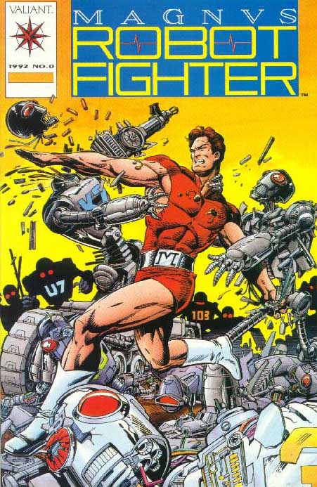
Valiant; originally offered as a mail-away premium
Valiant’s Magnus Robot Fighter #0 was the gasoline poured on the brush fire that was my personal excitement about the company’s early (we now call them “pre-Unity”) superhero comics. Each of the first eight issues of the regular Magnus Robot Fighter came with cards that could be collected and then redeemed for a copy of Magnus #0, meaning there wouldn’t be a huge supply of this issue from the start.
There were additional copies offered as retailer incentives – one copy for every 10 copies ordered of Magnus #1 – and the only difference between the send-away copies and retailer copies was a bound-in card in the send-away version.
For a recent, modern issue, it was relatively hard to get. That had the effect of making it more desirable, naturally, as did the fact that I had come a bit late to the party (I had only started reading Valiant titles with May 1992’s X-O Manowar #4, four months after Magnus Robot Fighter #8, the last one with the cards to redeem).
And the hunt only picked up speed when I actually saw the cover.
Veteran illustrator Paris Cullins, who penciled the interior as well as the cover, really captured Magnus at his best.
There were evil-looking robots (the red eyes were a telling sign) of varying designs with threatening weapons, and Magnus was just busting a path right through them, chopping metal with his bare hands. Magnus himself looks like a commanding presence, which he has to be to be done correctly.
Bob Layton’s inks are crisp, helping this story set the tone for the whole pre-Unity and Unity run of Magnus Robot Fighter.
While the thrust of this column remains about the cover itself, it would be a mistake not to mention the story. No one, not even Russ Manning – the best illustrator ever on the character – has delivered as many good Magnus stories as Jim Shooter, and this is one of his best. Like the art, it sets the tone for what followed.
The real gift for Magnus fans in what Shooter did is that the whole series works as a continuation of Manning’s version. It ignores the post-Manning issues at Gold Key and just goes from there.
Sure, it’s more sophisticated, but give them a read and see if you don’t see it.
I look at this cover and it just makes me want to go collect comics. Even ones I already have.
–J.C. Vaughn