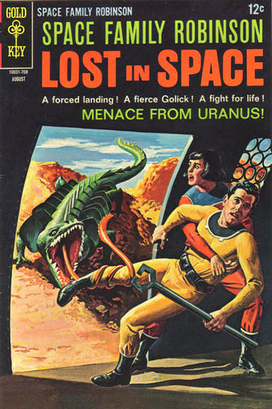
Columnist Mark Squirek is on assignment this week, so new contributor Kat Clements has jumped in with a look at this great cover...
When I was seven years old, I found my father’s stash of 1960s Space Family Robinson comic books. His collection was incomplete, but I remember flipping through those few, flimsy pages to become as lost in space as the Robinson family. To this day, when I think of comics, the first image that comes to mind is the cover of Issue #23, August 1967: “Menace From Uranus!”
This comic’s dynamic cover was produced by George Wilson. His preferred inspirations for these miniature masterpieces in oil and acrylic were Alex Raymond’s Flash Gordon comics and the sleek style of cartoonist/illustrator Noel Sickles. During his career, Wilson produced hundreds of covers for Gold Key, the brand of Western Publishing that focused on adventure, mystery, jungle, and science fiction stories. In addition to Space Family Robinson, Wilson’s credits include cover art for Korak, Son of Tarzan (1964), The Phantom (1962), Dark Shadows, Star Trek, and Voyage to the Bottom of the Sea. His work is usually unsigned, but recognizable by its action-packed, eye-catching style and realistic execution.
The cover of “Menace from Uranus!” presents a terrifying story. The upper third of the cover is the black interior of a space vehicle. Light streams in from a curved rectangular aperture to illuminate a young, dark-haired woman, Tam Robinson. She is struggling to pull her father, Craig Robinson, back into the ship. Her face is turned towards the ship’s opening, lips parted in a silent scream.
Framed by the opening is the reason for her fear: a green monster covered in fins and spines, a hybrid of crocodile, lizard, and fish. Its hideous jaws gape, revealing rows of sharp white teeth. From its maw whips a long, prehensile tongue, like a squid’s tentacle. The end of the tongue is coiled around Craig Robinson’s leg. Craig clutches a large wrench in his hand, but appears unable to use it against the beast.
The composition is uncluttered; there are only three characters and no explosions. Having the upper third of the cover painted black keeps the title and tagline from interfering with the drama below. The yellow of Craig’s space suit and the terrain outside dominates the color scheme. The brilliant green of the monster stands out in contrast, making it impossible to miss. Tam is dressed in muted red and blue, mirrored by the red of the monster’s tongue and the blue of the sky beyond the desolate ridge.
It is a relatively simple image, yet it contains so much fear. Tam and Craig were not ambushed by this monster while trekking through alien wilds. That is a scenario we would expect. Instead, it attacked them while they stood within the safety of their own ship. Now Tam is locked in a struggle with this monster as she fights for her father’s life. It reminds us that each time we open a door to an alien world we do not know what may be waiting for us. It could be a quiet, breath-taking landscape filled with promise. Or it there could be something outside waiting to eat us.
Kat Clements graduated with a B.A. in English from Penn State Mont Alto, and currently works as a public librarian and freelance editor. When she isn’t reading fantasy, science fiction, Japanese manga, or comic books, Kat continues work on her fantasy novel Ravens and Roses.


