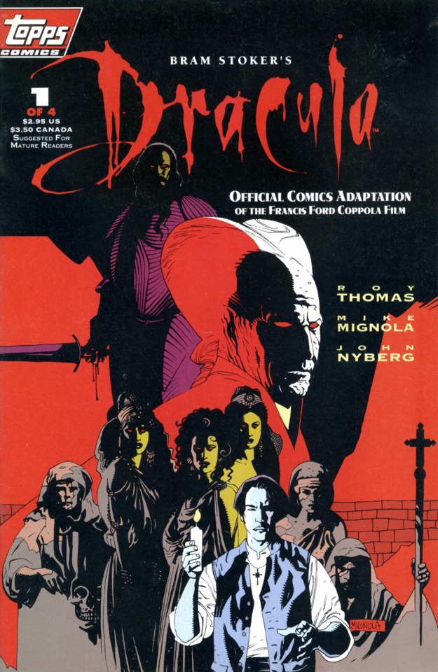
Topps Comics; $2.95
In their short run as a comic book company, Topps put out a solid number of interesting comic books and a number of truly great ones. While the industry still talks about how many female readers Neil Gaiman’s Sandman brought into the fold, there was a period when Topps’ X-Files comic was bringing in as many or more. And then there’s Bram Stoker’s Dracula, their adaptation of the Francis Ford Coppola film. It ranks as one of the company’s best.
Veteran writer and former Marvel Comics Editor-in-Chief Roy Thomas handled the script, relative newcomer Mike Mignola penciled the art, and John Nyberg served as inker. Not noted on the cover, but also key to the success of this issue, was the choice of Mark Chiarello as the colorist, and it certainly didn’t hurt to have another veteran like John Costanza doing the lettering. Editor Jim Salicrup put together what by just about any definition is an all-star team, and boy, it paid off in spades.
Moody, evocative, and compelling, the pages drip with atmosphere and carry the story forward at a pace fans of the movie will recognize. Although some of the panels are by necessity very talky, there are others in which it’s all on Mignola, Nyberg, and Chiarello to tell the story. It works.
After reading this issue upon its debut, I knew immediately that I’d be picking up the whole miniseries. There’s always a bit of trepidation in rereading something years later, wondering if it’s going to stand the test of time. This one did.
While the work has been collected, there’s some fun in hunting down the individual back issues. They’re not always so easy to find in high grade, but they’re definitely worth the chase. Also, there’s a red foil logo version of this issue that is particularly cool.
- J.C. Vaughn