

Duncan Eagleson is a self-taught painter and former graffiti artist who works as a freelance illustrator. His body of work includes book covers, comic book art (including issues of Shade, the Changing Man and Sandman), band/musician t-shirts, and movie posters, among others specialties. One of Eagleson’s special pieces is a prerelease movie poster that he created for A Nightmare on Elm Street, when director Wes Craven was still searching for financial backing of his horror film that would introduce Freddy Krueger.
Eagleson’s original art for his Nightmare on Elm Street poster is now being offered to collectors at Hake’s Auctions. As the auction went live, Eagleson talked with Scoop about the art, how he got involved with the project, and the genesis of his poster design. He also talked about his career, how he became a professional artist, some of his favorite projects, and what he’s working on now.
Scoop: When did you know that you wanted to be an artist?
Duncan Eagleson (DE): I was drawing as early as I could hold a crayon. I think the idea of becoming a professional artist probably took hold once I was old enough to realize that the images I saw on books and magazines and movie posters didn’t just magically appear there, but there was actually someone whose job it was to make those images.
I think the first artists whose names I became aware of were the illustrators of the comics – people like Neal Adams, Gene Colan, Gil Kane. Then there was Basil Gogos, who did those wonderful paintings for the covers of Famous Monsters of Filmland magazine, and of course Frank Frazetta. I had those Lancer Conan paperbacks with the purple edged pages that featured Frazetta paintings on the cover. Those images cemented the idea of eventually doing something like that for a living.
Scoop: How did your professional career start?
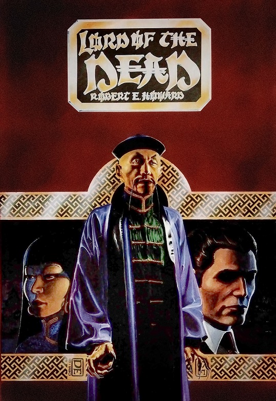
DE: My first few professional works were in graphic design. I had worked several years as a copywriter for an ad agency in Providence, RI, and they had let me do some work on some of their ads. Subsequently I worked in the art department of a printing company, and while I was there, I came across these hardcover collectors’ edition books that reprinted some of the old pulp magazine authors: Robert E. Howard, Talbot Mundy, A.A. Merrit, and others, with new illustrations by contemporary artists. The publisher was Donald M. Grant, and when I discovered Grant was headquartered in Rhode Island, I wrote them a letter asking if I could illustrate something for them, enclosing some samples of my work. To my surprise, I received a letter back from Don Grant himself, with an invitation to come for an interview.
I was even more surprised when the address I arrived at for the interview was a private house. It turned out that as prestigious as Grant’s books were considered, it wasn’t a big company at that point, it was just this one guy with a printing press in his basement. Don hired me to illustrate Robert E. Howard’s Lord of the Dead. I did a painting for the dust jacket and ten or so black and white interior illustrations, and that was my first professional illustration gig.
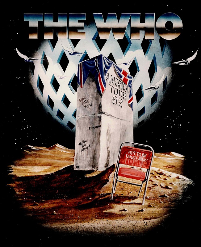
Shortly after that I moved to New York City, and worked for a year at a studio where I was designing the official concert t-shirts for various rock groups. This was the early ‘80s, and we were designing shirts for groups like The Who, Def Leppard, The Clash, Phil Collins, Eric Clapton. After a year of that, I decided to go freelance, and started taking my portfolio around to publishers and ad agencies.
Scoop: How did you get involved with the Nightmare on Elm Street ad campaign?
DE: I’d been doing book covers and magazine illustrations by that time and was interested in getting into movie posters. Most of that work was out in LA, but there were a few being produced in New York. I interviewed with Bill Gold, who ran a studio that specialized in film posters, but though he liked my work, his staff was full up at the time, and he didn’t use freelancers, everything was done in-house. I think it was him who pointed me to New Line, who were also headquartered in Manhattan then; they hadn’t moved to LA yet. I got an interview there with Bob Shaye, and he hired me to do… I think the first one was Blade Master with Miles O’Keefe.
At that time New Line was primarily a distributor, but they were just starting in to producing films themselves. One of their first was Nightmare on Elm Street, and Bob hired me to create a poster for it that they could use to help raise money to make the film.
Scoop: How much were you told about the movie to inspire the poster’s design?
DE: I wasn’t actually told that much, they just gave me a copy of the script, and basically said “Come up with something cool.” By that time, I had done several posters for them, and I think they had come to trust my instincts. Or maybe they just didn’t know themselves what they wanted.
Scoop: Did they give you input on what Freddy’s glove would look like?
DE: Nope. All I had to go on was the script, which didn’t describe the glove except to say it had gleaming metal claws. To be honest, I had never realized the poster had the wrong number of claws until I was talking to [Hake’s President] Alex Winter about selling the original, and he pointed that out. No one at New Line had ever said anything about it.
Scoop: That’s the kind of noteworthy difference from the movie that collectors and horror fans will like.
DE: Yes, I suppose it’s a little like when a book or a stamp or something gets printed with a mistake and gets recalled and reissued in a corrected version, it drives up the value of those misprints. Of course, there’s only one of the original painting, but perhaps as you suggest, that disconnect from the final film will make it that much more appealing to collectors. [Laughs] One can only hope.
Scoop: What other designs did you consider before landing on the one you created?
DE: At that point there was nothing – no concept art, no one was cast yet, I had nothing to go on but the script. I would have loved to do a Drew Struzan or Bob Peak style painting showing some of the characters, but since we had no cast yet, that wasn’t practical.
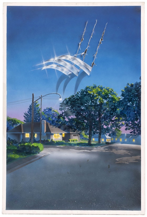
Honestly, I don’t remember considering many other approaches. I don’t think I even did many sketches for it. When the idea struck, I called Bob up and said, “How about we show Elm Street – your average suburban neighborhood – with Freddy’s claws tearing through the picture, like the claws on the poster for The Howling?” He loved the idea and said, “Go for it.”
So, I was looking for reference on suburban neighborhoods that might stand in for Elm Street, and my roommate at the time handed me a photo of the small town in California where he’d grown up, and said “I always hated that town, I’d love to see you paint it being torn apart by giant claws.” So, I did.
Scoop: Were you tempted to include more details from the script, or did you think that might detract from the reaction of seeing a claw shredding the peaceful night sky?
DE: Yes, once I hit on that basic idea it didn’t seem like it needed anything else. I did briefly consider putting Freddy’s silhouette over the whole thing, or in the background somewhere, but that didn’t seem to work – it seemed like overkill. And anyway, doing that could have been problematic. The script wasn’t loaded with very specific descriptions – most screenplays aren’t, especially in the early drafts. As best I recall, it mentioned Freddy had this clawed glove, and a hat of some sort, but that was pretty much it. I didn’t even know if he’d end up being played by some big hulking fellow or someone gaunt and emaciated, so even a silhouette could have missed the mark. I suppose that might not have mattered, as at that point it was just a promotion to raise money, and any mistake could have been corrected once the movie was made. But as it was, the lack of specificity allowed them to use it as an actual release poster in some foreign markets without any changes. I suppose they could have asked me to add a fourth claw, but I’m not sure anyone at New Line ever noticed that discrepancy or would have cared particularly if they had.
Scoop: Did you draw inspiration from any other sources aside from The Howling?
DE: Not from any other movie posters at least. Even though the poster was in color, I did have in the back of my mind some of Val Lewton’s old black and white movies, like Cat People, and the way cinematographer John Bailey could make the most mundane setting seem threatening and ominous purely through his use of light and shadow. Of course, my reference was all shot in bright daylight, so I had to improvise the lighting. I was hoping I could make that nice suburban neighborhood seem somewhat eerie even without the claws ripping it apart. I’m not sure how thoroughly I succeeded at that, but I suppose in the end it doesn’t matter that much, since we do have those claws tearing through, and that carries the image.
Scoop: You’ve created art for movie posters, book covers, comics, t-shirt designs for musicians, and the list goes on. What have been some of your favorite projects?
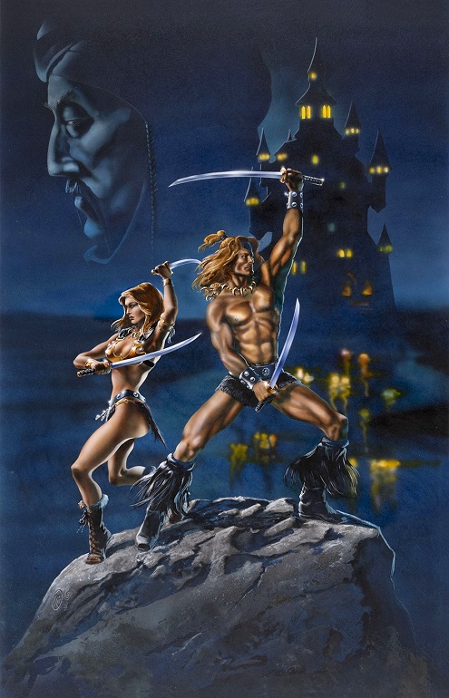
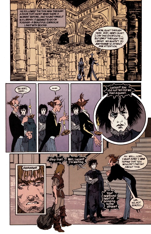
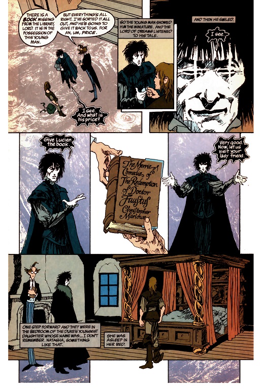
DE: Well, the longer-term projects, like comics or illustrated books are always fun, because it’s a series of related images and not just a one-and-done sort of situation. I loved working on Neil Gaiman’s Sandman comic, and the graphic novel version of Anne Rice’s The Witching Hour.
I was also delighted when Tor Books asked me to do the cover of No Blood Spilled, by my friend the late Les Daniels. Les’ books about his vampire, Don Sebastian de Villanueva, are great horror novels, and it was a real treat to illustrate one of them. That painting was also a sort of homage to one of my own favorite artists, Bob Peak. People have pointed out that it bears a certain resemblance to Peak’s poster for Apocalypse Now, and I’m, like, “Yeah, that was totally intentional.” It has become one of my most popular paintings, and I’ve probably sold more prints of that than any other piece I’ve done.
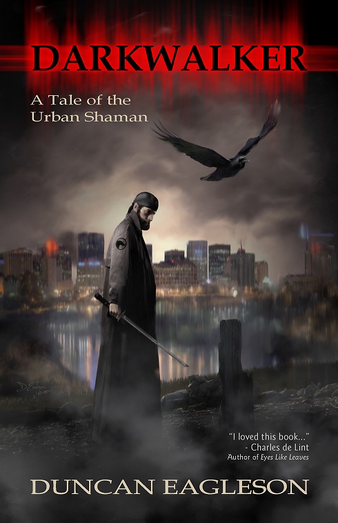
I think my least favorite project was creating the cover for my own first novel, Darkwalker. I was working as the art director for the company that published it, and had several other artists in mind for it, but they were all too busy, and the publication deadline was looming, so I bit the bullet, and painted it myself. It was hard, because I was too close to the material, and had a hell of a time deciding between the tons of sketches I developed for it. In the end I was pretty happy with the result, but the process of getting there was kind of excruciating.
Scoop: What are you working on now?
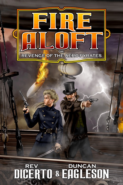
DE: A few years ago, my friend Rev DiCerto and I collaborated on a steampunk novel, Fire Aloft, which was published by Crossroad Press. The rights have now reverted to us, and I’m developing covers for a new edition of that, and our new sequel to it, with the working title The Plot Malign. We’re self-publishing, hoping to have both books out by this fall.
The other project I’m excited about is my new studio. We recently bought and moved into a beautiful old Victorian house, and there’s a barn on the property with a thousand-square-foot loft area that I’ll be renovating and converting into a painting and sculpting studio. I’ve been doing mostly digital work the last few years, and I’m really looking forward to having the space to do big traditional media paintings again.