

Since graduating from Parsons School of Design in New York City, Noelle Giddings has created a body of work that ranges from comic books to fine art. A start in advertising and story board work led to comics, where she spent more than the next 20 years working as freelance artist for DC, Marvel, and Dark Horse on such titles such as Batman, Superman, The Flash, and Spider-Man. She became the Color Editor of Milestone Media, helping to launch all of the initial titles including Static (later Static Shock), Hardware, and Icon.
She became an animator for the long running Nickelodeon show Doug, illustrated two children’s books, Half and Half and Christmas with Grandma, and has taught illustration and comic book art at museums including the Cooper Hewitt International Design Museum. In recent years she has created original cleared art for the television and film industry. Able to create art in all styles in short order, her artwork has been seen on HBO, Showtime, CBS and others.
Giddings continues to work in comics, including 2023’s Milestone 30th Anniversary Special #1. She has recently been working on a series of large scale paintings that represent her painted color pages from the bygone era of pre-computer classic colored comics. An ongoing labor of love, they can be seen in an article in American Art Collector Magazine issue 213) and the RJD Gallery, which represents her “The Lost Art” paintings.
With some of her Milestone original color art featured at Hake’s Auctions in their current Auction #240, and with the growth in collecting original color work, Scoop talked with Giddings about her career, her process, and being a part of the change that the original Milestone Media era ushered into existence.
Scoop: In the comic book world, you’re best known for your work at Milestone Media, but before Milestone, you’d been working at DC, right? What had you been up to at that point?
Noelle Giddings (NG): I had been freelance in comics for many years sharing an art studio, Studio X, with Denys Cowan (and in the early years, J.J. Birch and Jim Sherman). My first early jobs were with Marvel. In fact, they offered me to pencil the Barbie comic book that they were getting going on, and said I could design her clothes (I guess that was a perk) [laughter]. I remember thinking I wanted to do cool stuff like Spider-Man. I painted a Hellraiser graphic novel (blue line in those days felt artistic and cool), and the Spider-Man 2099 series with Rick Leonardi, which was beautiful. I loved painting those book (and still have many of my original guides and issues), Black Panther with Denys Cowan, Nexus with Steve Rude, and lots of others. I did eventually settle in with DC and did hundreds of books in the end – lots of Batman, Superman, Aquaman, Catwoman, Nightwing, Robin, Green Lantern, Scooby Doo, as well as plenty of books for Vertigo… So many I can’t even remember (most of the art is all still in boxes, though)!
Scoop: Your color work is different than some other approaches. These are not traditional color guides from earlier eras, but your pieces are actual painted artwork. Can you explain the process that went into making each of these pieces?
NG: Yes, color guides in the early days when I started, which was pre-computer, had limited color choices. There were 64 in the early day, based on four percentages of each primary color and their mixes. Y2 Y3 Y4 and Y, meaning 25% increments of each of them. The colorist had to write the codes on the page for the separator to “read” the colors and cut the film. It was a very limited pallet. Then they went to 10% increments, which meant more color choices, and at that point computers were kind of getting going with special effects.
When we started at Milestone, I was the Color Editor and it was my job to work out how the books, and the whole Universe, should look color-wise. Skin tones (so many that Y40R40B25 wouldn’t do it), costumes, power effects, the city of Dakota, the bridge, the characters’ homes, Static’s lighting bolt and jacket and school, all of it. I pictured the books with a “natural” and “real” feel color-wise. Not a slick or limited palette, just kind of real. And so, it seemed that the best thing to do was to leave out the computer, and the person in between, the slick effects, etc. I thought if we painted the pages and they were the original, camera-ready art to be shot and printed from, we would get that feel for the Milestone Universe.
And we did! The only thing is that the newsprint the books were printed on was the cheapest of paper and sucked up all the ink, so the printed pages never got to look as amazing, bright and colorful, as the originals (but printing was about the cost and also was up to DC, that was part of the deal with Milestone).
Scoop: So, the artist’s original work was output onto artboard or stats was what you actually painted. What kind of feedback did you get from the pencil and ink artists about your colors on their work?
NG: I got great feedback! Everyone was really digging the look – it seemed to me – of what we were doing. We were in Manhattan, and so many of the artists would come around to the offices, maybe to drop off pages or just hang around. I was there painting all day and overseeing the other colorists I hired to paint books, so there was always feedback going around. I did so many covers and thought they were all special and beautiful. Approaches shifted when I was working on John Paul Leon’s work (he was around a lot). I knew his taste and tried to work colors that did his beautiful, elegant artwork justice, and Denys’ fabulous work on Hardware, and I could go on… I approached painting each piece like a unique, important, and beautiful work of art – and they were.
Scoop: Did you have a favorite artist with whom you worked or was it more about Milestone as a whole?
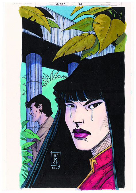
NG: Honestly every cover I painted, all the pages of the books, posters, trading cards… I really loved getting into the creative challenges that each piece of black and white art represented. My job was to tell the story and make it look great! and I loved doing that and gave it my all every time. That being said, I really looked forward each month to receiving and getting a look at the black and white art for Xombi. I thought John Rozum’s writing with J.J. Birch’s art was incredibly creative and strange and so fun to bring to life in color!
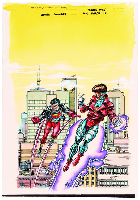
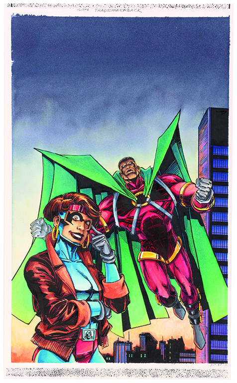
Scoop: Your work on the covers would be among the first things potential readers would see. What – if any – pressure did you feel since you were helping to start the Milestone line?
NG: I loved being a part of bringing the cover to life! I was extremely aware of them being on a shelf lined with other comics. They needed to be eye-catching and dynamic and beautiful. They needed to be especially good as we were new, and Milestone had a big mission! We were already different, calling attention to ourselves, so the art needed to be great! No pressure [laughter]. I was confident, though. The black and white art and the story would give me clues as to the direction of the colors, and I was off!
Scoop: Did you have a specific tone that was your signature style or was it more about letting the content and the art direct your choices differently for each piece? Did you have different approaches to the respective titles based on their stories?
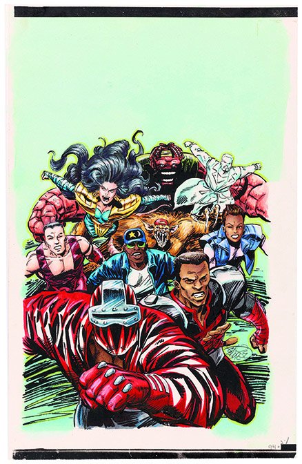
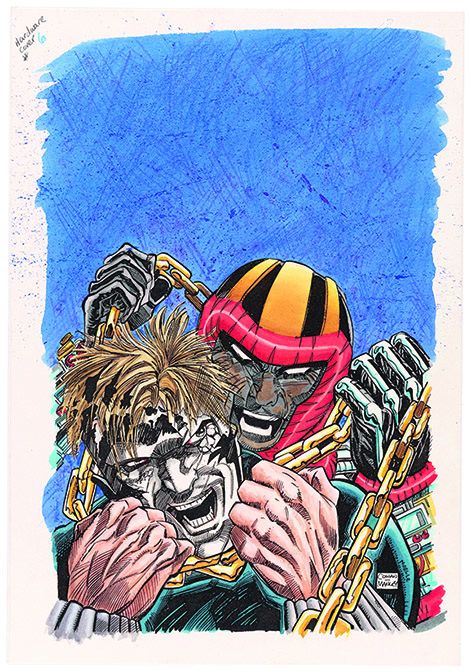
NG: All parts of the are team are illustrators, right? Our job is to tell the story. Of course, we want to do that in the best looking way possible. I have my taste – kind of clean, clear, not too flashy. I still look at and love Mobius and Frank Miller’s Ronin, but each story has its own feel and I tried to be respective of that. Static is young, could be bright and electric (get it? :) and fun. Blood Syndicate had more of an edge and was darker (with humor, too). Hardware was more sophisticated in away and in its way, adult. Shadow Cabinet was just artistic and beautiful.
Scoop: It seems that several of your pieces were just a bit lighter – not overwhelmingly so, but noticeably – than they reproduced. Is that an accurate observation or is it too much of a generalization?
NG: No, that is accurate. It’s part of the printing and paper issue I mentioned earlier. Somewhat true of covers, very true of interior pages. The original art stands out as being a brighter, clearer – just a bit more dynamic and maybe intense than the printed version… just the printed version but better!
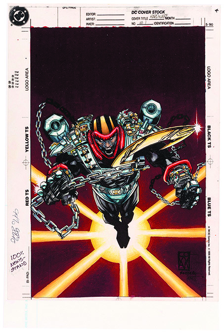
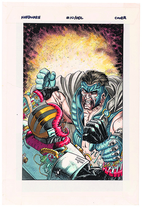
Scoop: On the cover for Hardware #1, you utilized what looks like brown as the dominant background color. 20-25 years earlier, that was something that happened more frequently, but in the ‘90s that was rare. This cover really stood out. How did you come up with that approach?
NG: That’s funny – I would not call that brown [laughter], though I admit it did lean a little more toward brown in the printed version. It’s the darkest maroon. It’s the color in my mind of an explosion in the darkest night. It’s Hardware with the blast explosion behind him, you would see the fire roll out into the black of night, the light and warmth, yellow, orange, red as it deepened in the distance into the blue black of night. I wanted it to be rich and dark and dramatic. I think I got it.
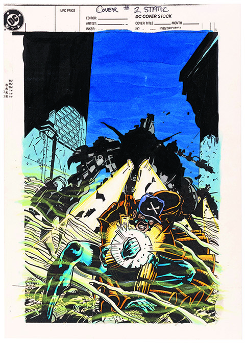
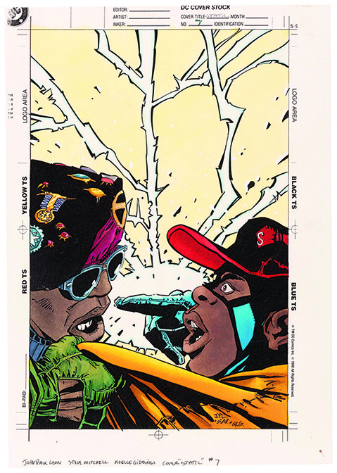
Scoop: While many of the covers – like a lot of superhero comics – use darker colors, Static #7 went the opposite direction. I remember it standing out on the racks at the time. Was there any different thought in that one when you were working on it?
NG: John Paul Leon, Steve Mitchell, and me – beautiful art – loved painting all the Static covers. It was about Static being a kid and how the palette of the book should reflect that. Virgil was an awkward and funny teenager, so even when there was a dark subject, I always wanted to keep some bright and energetic look and feel – maybe a “youthful” quality represented in the color art. In that cover he’s dealing with Commando X – heavy stuff – but he’s always got that kid light…ya know?
Scoop: Just a few years ago, prices for original color pieces were not in high demand, but now collectors have started to recognize them for what they are. Correspondingly, demand is increasing. With these pieces now offered at Hake’s, is there anything about them you’d like to call out?
NG: Any Milestone fan should enjoy a walk down memory lane when looking through the original hand painted cover art from the early days. We’re talking 30 years ago! They’ve have been untouched in boxes waiting to see the light and here they are. I am sad to see them go, but also know Milestone fans have been so amazing and loyal and inspired by Milestone, it’s cool to see some of them go to homes where they will also be appreciated.
– J.C. Vaughn
Hake’s Auction #240 is live now. The session featuring Noelle Giddings’ original color art will begin closing at 9 PM on Wednesday, March 20, 2024.