Editor's note: This feature article and many others appears in The Overstreet Comic Book Price Guide #43, which is currently on sale.
By Peter Bilelis
Looking through my old editions of The Overstreet Comic Book Price Guide, I found very many interesting articles that span the birth of the four-color medium to current topics. Given the importance of the First Heroic Age (or Golden Age), articles devoted to this period have run the gamut from the contribution of several period artists to the socio-political importance of “comic books going to war.”
As a fan of great comic book artists and the Golden Age, I found it interesting that in 40-plus years, the Guide has not had an article devoted to the greatest World War II era comic book artist and his paramount contribution to the hobby (though he was in the first class inducted into The Overstreet Hall of Fame).
I will try my best to do him justice…
I was introduced to comic books in the early 1970s. One Autumn, my family decided to build a vacation around one of dad’s business trips to Chicago. We traveled from New York City by rail. As the train roared through the pitch black evening, we huddled around dad in our sleeping room as he read us the three-part Two-Face story from Detective Comics #66, 68, 80, which had been reprinted in DC Super Spectacular #20. Between the “romance” of traveling by rail and dad adopting different voices for the different characters, the trip was quite an adventure. And the Two-Face story was beguiling. I soon began collecting comic books, always preferring the 100-pagers to the regular books. Little did I realize that the main catalyst for my desire to collect – the stories that offered more believable stories and moodier artwork – were actually reprints. I was unknowingly being introduced to the Golden Age of comics and its long-forgotten heroes.
My collection slowly grew and even began to include Golden Age books, comprised mainly of DCs and Timelys. By the mid 1990s, however, I rediscovered Shazam! #8. The reprinted Captain Marvel, Jr. artwork blew me away! It very much reminded me of Hal Foster’s Prince Valiant and Alex Raymond’s Flash Gordon work. Over time, I came to realize how different that Captain Marvel, Jr. artwork was from virtually everything else I’d ever seen in comic book form. I decided I wanted to add books to my collection that featured this amazing artwork. The artwork in that Captain Marvel, Jr. story was credited to Mac Raboy.
Manuel “Mac” Raboy was born on April 9, 1914 to parents Isaac and Sarah Raboy, who had emigrated from Romania. Raboy was a native New Yorker, attended DeWitt Clinton High School in the Bronx (as did many other Golden Age talents, like Bob Kane, Bill Finger and Will Eisner) and was a southpaw (evident in his self-portrait). He began his art career during the Great Depression, working for the Works Progress Administration and Federal Arts Project (a New Deal government-sponsored employment program). While working for the WPA and FAP, he created beautiful wood engravings. Raboy had learned this skill while at Clinton.
He had attended art classes where he learned the art of wood engraving and was encouraged by an art teacher to develop his talent. Between December 1935 and early 1939, Raboy created over one dozen engraving prints that depict the 1930s during the Great Depression era. These engraving prints were so attractive some were put on exhibition at the 1939 New York World’s Fair and elsewhere. While working for the FAP, Raboy attended the Pratt Institute and Cooper Union. Thereafter, Raboy worked for Disney (for a short time) and then for the Harry ‘A’ Chesler studios, one of the four main talent houses that produced packaged comic material on contract for other publishers. At Chesler, Raboy was surrounded by a who’s who of great emerging comic book talents, such as Lou Fine, Jack Cole and Fred Guardineer.
DEVELOPING STYLE
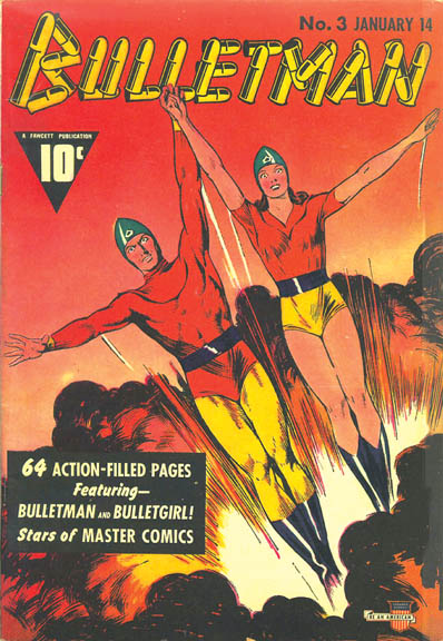
While at Chesler, some of Raboy’s first assignments were the Green Lama (a Prize Comics feature), Ibis the Invincible, The Man of Mystery and Dr. Voodoo (a Whiz Comics feature). Arguably, his earliest comic book work was not that much different than the work being produced by other artists of the period. While Raboy’s art talent was already apparent, he had yet to perfect his style and distinguish himself. But, Raboy’s style and growth became more graphically evident in each succeeding Dr. Voodoo tale. In fact, by the end of 1940 Raboy’s signature style was fully developed, as can be seen most prominently on Bulletman covers for Master Comics. He soon became the chief artist for Bulletman stories.
LITTLE BOY BLUE
Ed Herron was a creative genius and responsible for creating several comic book characters at Timely Comics. He moved over to Fawcett Comics and, during Autumn 1941, Herron helped formulate an addition to the Fawcett family, which at the time comprised several characters including Captain Marvel and Bulletman. Captain Marvel, who had debuted in February 1940, was a growing success that would soon eclipse Superman in circulation. The premise of a boy magically turning into a full-grown super-hero was likely more intriguing to the typical young reader than a grown-up hero/alter-ego character. So, instead of giving “the Big Red Cheese” a teen sidekick (as seen in Batman and Captain America), Fawcett decided an adolescent version of Captain Marvel would more greatly appeal to their young readers.
Herron wanted a more illustrative style for the new addition, as opposed to the C.C. Beck simplified approach on Captain Marvel. Herron was a huge fan of Raboy’s work and requested Raboy to be assigned to personifying Fawcett’s newest brainchild. Raboy’s vision for the character was a 13- or 14-year-old, 98-pound weakling. Unlike Captain Marvel, Junior would physically remain a boy and would be idealistically handsome.
Raboy soon started working on the artwork for the origin story, which was written by Bill Woolfolk. Unlike anything seen before in comic books, the origin story would be presented in a trilogy that began in 1941 and ended in 1942, crossing over two Fawcett “A” titles.
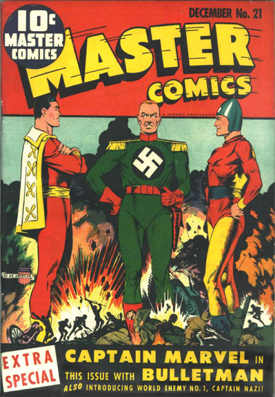
The cover of Master Comics #21 rendered by Raboy features Captain Marvel and Bulletman flanking a grinning Captain Nazi (in his debut) while a WWII battle rages at their feet). Given Captain Marvel was not a Master Comics feature, the cover made it clear that this would be a very special book.
In fact, Master Comics #21 was a comic book tour-de-force. Not only did it do something that no other comic book had done to that point – team a publisher’s two most popular heroes that headlined separate titles to overcome a villain – but it also introduced one of the most sinister and deplorable WWII villains ever conceived – Captain Nazi.
Unlike the character assassination treatment with which other books were treating the Axis bad guys, Captain Nazi easily could be mistaken for a good-guy. Raboy rendered him as tall and handsome, with a dashing military uniform that arguably put Blackhawk’s uniform to shame. On top of all this, the story and artwork were spectacular. Raboy’s style was clearly in a master class by this point. The cover was an absolute stand-out when it appeared on the newsstand before Thanksgiving 1941 (and only weeks before the Japanese bombed Pearl Harbor, plunging the United States into World War II).
The story’s characters and backgrounds looked and felt real in appearance (compare this version of Captain Nazi to that rendered by C.C. Beck, a muscle-bound caricature). In the issue, Hitler introduces Captain Nazi to his high command in a clandestine meeting and then sends his Nazi superman to the U.S. to wreak havoc. After a cat-and-mouse game of death between the heroes and Captain Nazi, there is a showdown between Captain Marvel and Captain Nazi. After an explosion in which Captain Nazi is presumed dead, Captain Marvel finds a note from Captain Nazi, challenging him to continue their battle in Whiz Comics #25.
With no cover fanfare as to its contents, Whiz #25 provided the core origin story of Captain Marvel, Jr. The story is well written and certainly is one of the classic origin stories from the period. At the hand of Captain Nazi, a young boy named Freddie Freeman is left for dead. As a last resort in saving Freddie’s life, Captain Marvel takes the boy down the old forgotten subway tunnel where Captain Marvel’s alter ego, Billy Batson, first encountered Old Shazam, the Wizard that transformed Billy into Captain Marvel. With Freddie in his arms, Captain Marvel summons Old Shazam. The Wizard saves the boy’s life by bestowing in him the power of Captain Marvel – and Captain Marvel, Jr. is born! My only disappointment with Whiz #25 is that it was a Raboy/Beck collaboration, rather than pure Raboy.
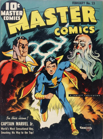
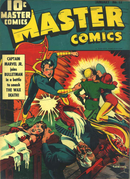
Master Comics #22 features the first cover appearance of Junior. In this third and final installment of the trilogy origin story, Bulletman and Junior join forces to defeat Captain Nazi and Dr. Eternity, a deranged anti-American. While the cover is arguably just “okay” in comparison to Raboy’s cover for #21 and subsequent examples, the interior artwork shows the spectacular talent he possessed.
His figures, whether standing still or in motion, were always drawn to anatomical perfection. He was capable of drawing flying sequences that were unlike anything that had been seen in comic books. His flying figures looked buoyant and realistic, creating the definitive floating and flying sequences. His use of light and shadows always created the perfect mood for the scene.
Raboy not only rendered the stunning characters but also did all the backgrounds, including landscapes, snowscapes, stone mansions set on sprawling lawns in the shadowy moonlight, and so on. From this point on, Junior was the lead feature in Master Comics, as well as a permanent cover fixture. The title’s circulation soared, as did the work demands on Raboy.
LITTLE HELPING ELVES
In 1941 and 1942, Raboy rendered some classic covers for other Fawcett titles besides Master Comics, including America’s Greatest Comics, Bulletman, Captain Midnight, Spy Smasher and Xmas Comics. But he was the slowest Fawcett artist in those days. Perhaps the reason for his slow pace was that second-best was not an option for him. If not satisfied, he would erase or destroy an entire day’s work and start over.
While Fawcett was delighted with his work – especially his covers – it was obvious to his editors that Raboy would never be able to meet the growing work demands. They decided to hire Rubin Zubofsky (who later changed his name to Bob Rogers) to do backgrounds for Raboy, as well as several others to help with the ancillary chores associated with the artwork, to ensure it was completed on schedule. Examples of “pure” Raboy can be seen in Master Comics #21 – 23 and probably 24. Most likely beginning with #25, Zubofsky did the backgrounds. Even with this help, deadlines often were in jeopardy. This led to a clever process. Perhaps starting as early as Master Comics #25, Raboy would oversee the use of photostats of panels or figures he had previously drawn. He also would draw characters using a side or rear view to eliminate all the extra time needed to render a character’s face. Luckily, these processes worked, and each issue of Master Comics featured a stand-out cover and interior artwork.
CLASSIC COVERS
In terms of WWII era comic books with classic war covers, those done by Raboy must be considered to be the very best. Just about any issue of Master Comics from 1942 – 1944 features one of the all-time great comic book war covers, each of which can double as a WWII pin-up poster. Many of his covers for other titles also fall into this category, including those mentioned above. In fact, he took great pains to produce covers that were “posteresque” in design and patriotic in theme. You’ll note that not one of these Master Comics covers has a word balloon. None have that cluttered style seen on many of the other publishers’ offerings.
Laying Master Comics #21 – 45 next to each other showcases the diversity of composition and theme of his work. For comparison, consider many of the Timely offerings from this same era.
Finally, Raboy rendered many of these covers (and many of those for other titles, such as Captain Midnight and Captain Marvel, Jr.) in what I would call the “epic story” style, each having the fictional characters almost naturally embedded in a real-life significant historical event or setting. Here are some of my favorite examples of the cream of the cream:
Master Comics #24 – perched high on a rooftop, Junior is cloaked in darkness on this moody cover. This is probably one of the more subtle war covers, as it’s not readily apparent that Junior has a very specific purpose – he has uncovered a nocturnal gathering of Fifth Columnists, a very real concern at the time of this book’s publication (Hollywood addressed this wartime concern in several period films, including the Humphrey Bogart film noir, All Through the Night).
Master Comics #26 – features a cover in which all the elements come together well for which Raboy is so highly revered. Junior is majestically floating front-and-center over a sea-foam green background. He is high above a Japanese destroyer in the South Pacific, raining down destruction in the form of huge bombs. The anatomical structure and buoyancy of Junior is perfect. The bombs, warship and even the explosion are all almost photo-realistic, making this obviously fictional image almost believable.
Master Comics #37 – the cover features Junior, after having destroyed a Nazi warship, hauling a raft of surviving (and astonished) Nazis out of the North Atlantic night. Raboy uses vibrant bright color accents against a deep purple background in a relatively simple composition (a floating Junior, with outstretched arm and head turned back toward the raft) to create an almost three-dimensional image. Ironically, the events depicted on this cover likely resonated with many Americans, especially New Yorkers. This book appeared on newsstands only months after a Nazi U-boat, part of the failed Nazi Operation Pastorious sabotage attempt, ran aground off the coast of Long Island in the pre-dawn blackness of morning.
Master Comics #38 – features another almost three-dimensional cover image and is a fine example of Raboy’s mastery of spatial considerations to draw the reader’s attention. This classic cover features Junior, with an angelic smile on his face, flying right out of the cover at the reader. He is holding the front end of a Japanese aircraft carrier deck that he is literally tearing from the ship.
Master Comics #39 – a perfect example of how Raboy used subtlety in his imagery to create an even more powerful message. And, based on discussions with many Golden Age enthusiasts, I suspect the “what’s really going on here” aspect of this cover is more subtle than on any of Raboy’s other Master Comics covers. At first glance, it looks like Junior is simply surfing on a torpedo. Closer examination, however, reveals the torpedo was fired by an Axis U-boat and right before it is about to hit an Allied ship, Junior has landed on it, has made a U-turn (rescuing the Allied warship) and is surfing it back at the offending Axis U-boat.
In terms of iconic and patriotic war covers, Raboy rendered some of the very best:
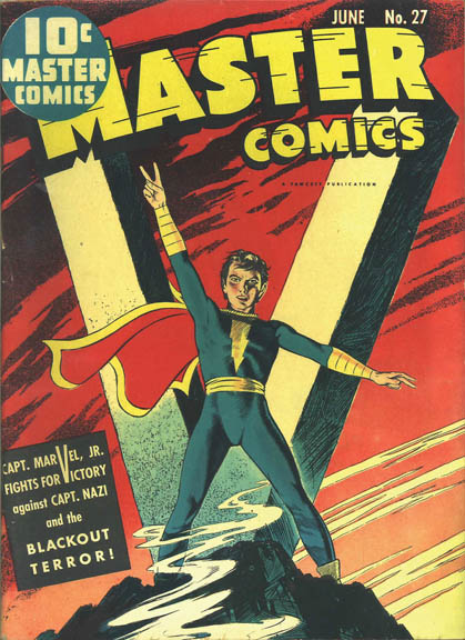
Master Comics #27 – features the “V for Victory” cover. The message was a sign of the times, and the cover is considered to be one of the all-time classic WWII era offerings.
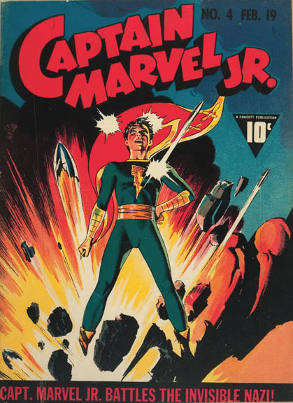
Captain Marvel, Jr. #4 – features the often-reprinted cover image of a smiling Junior standing tall and resolute despite a bomb blowing up under him. I suppose the message here is that nothing the Axis could throw at the Allies could deter the inevitable.
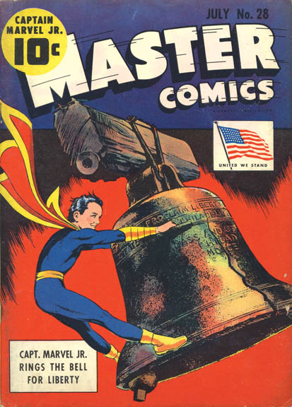
Master Comics #28 – the cover features Junior straddled atop, and ringing, the Liberty Bell. Not only is this composition unique, but the detail and realism of the huge metal bell astound.
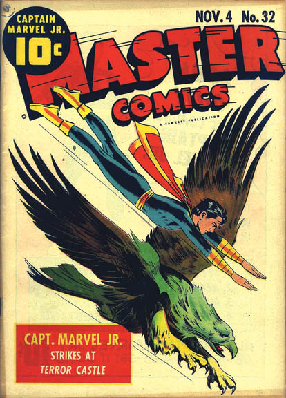
Master Comics #32 – features the very simple yet powerful classic American Bald Eagle patriotic cover.
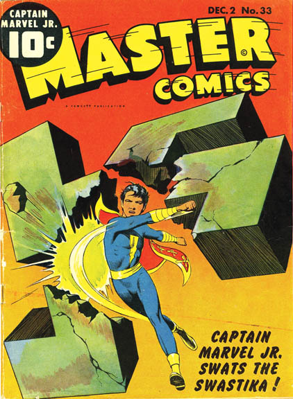
Master Comics #33 – features one of the all-time best WWII Swastika covers. While the classic Pep Comics #20 cover uses the Swastika as a symbol of Nazi tyranny, this one uses the Swastika in a very different way. It symbolizes Junior’s (and the Allies’) imminent victory over the Third Reich. Almost three-dimensional, this cover depicts Junior smashing a huge stone Swastika to pieces, with chunks of it seemingly hurtling out from the cover. There is no background, just Junior and the smashed Swastika, adding to the powerful message that the Allies’ victory would transcend any worldly constraints. Quite a message!
C.C. Beck once said that Raboy was the best artist to ever work in comics, despite not being a good comic artist. Like many artists from this era, Beck felt the comic book images themselves should be somewhat light or humorous. Raboy, however, did not subscribe to this philosophy. In fact, it was common knowledge that Raboy was partial to creating beautiful fairy tale sequences in which the characters and scenery were virtually “photo-realistic.” His prodigious talent was the glue that made it all plausible. None of this, however, stopped Raboy from rendering some of the best humorous images of the period – without compromise to his philosophy.
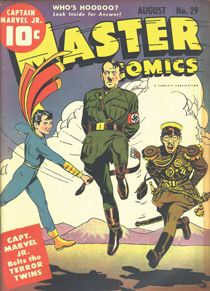
Further, these humorous covers belie the powerful satirical message each delivers. Standouts include the covers to Master Comics #29 and Captain Marvel, Jr. #13. The Master Comics #29 cover features Junior belting Hitler and Hirohito across their posteriors. The composition itself is hilarious, as are the Terror Twins, with their exaggerated pained facial expressions. But, all three characters are very realistically rendered and Raboy depicted the Japanese Imperial and Nazi military uniforms in full splendor. Despite this hilarious image, as any of the thousands of children that bought this book knew, a spanking is the result of bad behavior, administered by someone in a position of authority.
And, the Captain Marvel, Jr. #13 cover features an American football game. On its face, the image depicts a simple sporting contest between Junior and the Axis leaders, where Junior, playing offense, cannot be stopped in his forward progress. But again, the message couldn’t be clearer. Football is an all-American sport. The Axis leaders (“visitors”) are all novices to the game and the American (Junior) is the master, playing for the “home team” and reigning supreme. What’s more, Raboy’s work often included the creative element of bringing inanimate objects to life in a very whimsical yet realistic way. This was likely endearing to younger readers, given the robust imagination of children. Master Comics #41 offers a nice example, as Raboy brings Lady Liberty to life in a story-defining sequence!
Before leaving this topic, it should be noted that most Master Comics and other titles that feature Raboy’s work are highly coveted and sought after. Because of this, many of these books rarely turn up for sale, especially in higher grade. And, Raboy’s artwork transcends hobby interest, often collected by those who do not otherwise collect comic books. Additionally, many of these books feature stories written by the science fiction author Otto Binder. This means they often had better scripted stories than many other offerings on the newsstand. There is, however, something very special to putting together a run of virtually phantom books that have historical significance and that feature the very best work of the period.
MOVING ON
Raboy’s work was not purely relegated to a few Fawcett titles or just comic book work. In early 1943 the comic art staff at Fawcett converted mostly to a freelance status. It was around this time that Raboy started doing commercial artwork, which paid much better than comic book work. In 1944, he left Fawcett altogether to work for Spark Publications. This was a result of Fawcett editor Ken Crossen leaving Fawcett in mid-1944 to start his own publishing company. He convinced Raboy to quit Fawcett and join him at Spark, where Raboy would receive a piece of the action as the art director rather than just remaining a salaried staff artist.
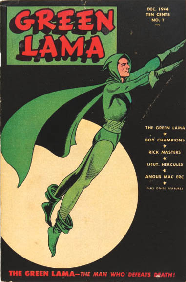
Raboy left Fawcett with an agreement that, if time permitted, he would still occasionally provide cover art for the Captain Marvel, Jr. title, which he did until mid-1945. At Spark, Raboy provided the covers and stories for Green Lama. The first issue debuted in December 1944, with a cover design like that of Captain Marvel, Jr. #1 – in this case, an image of the Green Lama almost floating in a green background. Raboy’s work on Green Lama was just as incredible as his work for Fawcett.
He went to great lengths to make Green Lama one of the most finely illustrated series ever produced. The cover of Green Lama #6 features yet another iconic image that makes a clear political statement. The Green Lama is about to cast from the Earth a giant crumbling swastika. As iconic as this cover image may be, the splash page is even better.
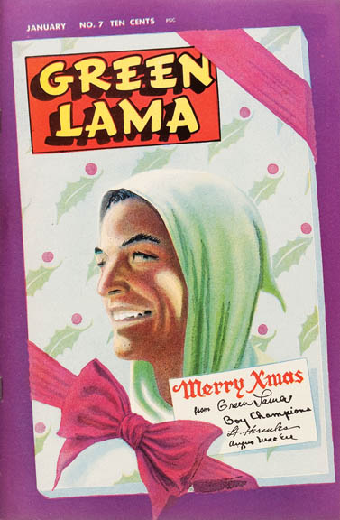
He continued to mature and grow in his mastery of the art-form and, for issue #7, shared this evolution with Green Lama readers. He drew a nine-page Christmas story titled “The Turn of the Scrooge!” that endures as one of the finest examples of his comic book work. He rendered it on Duo-Tone art paper, which allowed the artist to capture different tones of shading in the work. When color was added, the work transcended anything he had done before as well as other comic book art being produced by the hobby at that time. In fact, it wasn’t till approximately 10 years later, when EC Comics would produce books with a very similar look, that this type of artwork would be regularly seen in comic books. To a man who felt nothing was ever good enough (in terms of his own artwork), Raboy decided to complement this story with a special painted Christmas cover that features a portrait of a smiling Green Lama (I suppose Raboy’s genius blinded readers to a Christmas cover sporting a Tibetan Buddhist crime-fighter!). The image is very similar to an unpublished painting Raboy produced of Junior that may have been intended as the cover to Captain Marvel, Jr. #1. This book represents one of Raboy’s most valuable contributions to Spark Publications (and the hobby). By early 1946, it was clear that the sales figures for the Green Lama and The Golden Lad couldn’t sustain Crossen’s publishing endeavors, so Spark soon went out of business.
For Raboy, this unfortunate event may have been serendipitous. He continued to establish and work on non-comic book related commercial accounts. Between 1946 and 1947 Raboy secured a freelance job for which he provided full-page illustrations for the Philadelphia Inquirer newspaper. These illustrations were advertisements for famous historical sites and Raboy’s figures in these advertisements wore period-correct 18th century Colonial Philadelphia costumes. Each illustration provided anatomically perfect and beautiful figures and photo-realistic backgrounds.
I must confess that the first time I saw some of this work, I had a hard time accepting that it wasn’t rendered by someone else with the same name (each is signed “Mac Raboy”)! While I was taken by the stunning beauty and maturity of the work, it is more “serious” and finely rendered than that which he had produced for the comic book field. This work continued to showcase the incredible depth of his talent and it’s clear that he could have pursued a career in fine art. Ironically, Raboy had a fascination with early American history (the Civil War era in particular), so this work likely held a great deal of interest for him.
MOVING ON UP
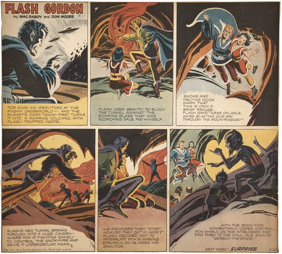
Raboy had for a long time wanted to secure a newspaper comic strip. At the time comic strips were considered superior to comic books (strip artists received higher pay, for one thing). In Spring 1948, Raboy was hired by King Features Syndicates as the artist for the Flash Gordon Sunday page. Ironically, one of Raboy’s biggest influences was Alex Raymond, and Raboy had a book full of Raymond’s Flash Gordon work as reference pieces.
His first Sunday page appeared on August 1, 1948. By September 26, the names of Mac Raboy and Don Moore (the writer) appeared on the masthead. For the entire period on which he worked on the strip, except January – October 1949 (when he hired Bob Rogers to do backgrounds), he did all the artwork for the Flash Gordon Sunday page.
Raboy’s prolific work on this strip resulted in approximately one thousand pages of artwork. He continued on the strip until his death. Many feel Raboy’s work on Flash Gordon was the biggest peak in his career, and this opinion is based on some good reasons.
A Sunday page only required Raboy to draw five to eight panels, so he likely didn’t feel the pressure to rush as he had while working on comic books. Indeed, working at his typical three-hours-per-day pace and always being several weeks ahead in production meant he could take the time he wanted on each art panel and would have no need to rely on Photostats and such tricks. With that said, I believe the very best Raboy comic-related work was that which he rendered for Master Comics and Green Lama. I’ll explain …
MAC THE MAN
Like anyone, Mac Raboy was a three-dimensional person and was many things in life: a family man with a wife (Lulu) and two children (David and Miriam); a man with good taste in automobiles (he was known to drive Cadillacs and a Chrysler Imperial). Like many New Yorkers, he was a man with a desire to move out of the City, and he was able to pull the trigger on this in 1947, building a large house of his own design (made from a surplus pre-fabricated Army barracks building, with one of three added wings serving as an art studio) in Golden’s Bridge, New York; a chain-smoker, known to work with a lit cigarette hanging from his lips; and a perfectionist with a strong work ethic. He also was an immensely talented artist and realized early that he could make a considerable living drawing comic books and comic strips. In fact, he was making $300 a week doing the Flash Gordon Sunday page when the average 1948 salary was approximately $55 a week.
While Raboy took pride for his part in the creation of Junior, he didn’t have much respect for what he did for a living and saw his comic-related work only as a means to an end. From all credible accounts, he had no other real interest in the medium or most of the people in it, preferring to leave work at work. He eventually made his children into “couriers” – paying them to bring finished Flash Gordon strips into King Features’ New York City offices so he could avoid the experience. He would never dream of giving away any of his original comic art as gifts. To the contrary, when King Features would return it to him, he would simply store it out of sight in a closet.
I believe Raboy’s outlook shaded the way many of his contemporaries perceived him. Most everyone with whom he had worked over the years described him as a very quiet man that rarely ever expressed an opinion on much of anything, including work, family or politics. Outside of work, however, he and his wife often entertained close friends that he had made over the years, including some from the comic book field with whom he shared common interests and a similar perspective of the business. Friends included Fawcett editor Rod Reed and Fawcett artist Harry Anderson and their wives. They would discuss politics (one of Raboy’s favorite subjects) and family, watch baseball games, play poker, and would rarely discuss business.
And contrary to his outlook on the comic art field, Raboy was happy to use his God-given artistic talents for so many other purposes. He built much of the furniture for his house. He made wooden furniture and woodcarvings that he would give away to family and friends. He sculpted clay torsos (often of Lincoln). For many years, he and his wife participated in the Golden’s Bridge Summer Stock Theater, and he constructed and painted the sets.
These differing accounts of Raboy likely confirm his negative feelings about the comic art field and his desire to concentrate on the things that mattered to him, like friends and family, and putting his energy into what he probably felt to be more worthwhile or “respectable” things.
In mid-1967, Mac Raboy was diagnosed with cancer. He was admitted to Memorial Sloan-Kettering hospital in New York City. Unfortunately, the doctors concluded there was little they could do, so he was moved to a Mount Kisco hospital to be closer to his family. He passed away on December 23, 1967 at the young age of 53. He left behind a legacy of some of the greatest comic book and comic strip artwork ever produced.
Raboy rendered beautiful, perfectly proportioned, realistic figures. He never resorted to motion streaks or the like. His figures looked weightless when in flight. The faces he drew were like portraits. And, while virtually all his artwork as of late 1940 is in a class by itself, perhaps the pride he took in helping to create Junior and his vested interest in Spark are the reasons why his work on Junior and the Green Lama endure among the very best examples of his work and comic book artwork in general from the period.
Given his outlook on the field, perhaps it is ironic that Mac Raboy’s work has inspired many comic artists in the 46 years since his passing.
Peter Bilelis is an Overstreet Advisor and a veteran comic book collector. He wishes to acknowledge Alter Ego, Creig Flessel, Marc Swayze, and Jim Steranko’s History of Comics in his research for this piece.


